Making Connections

Making Connections
A Gallery Talk
Given by
Professor David Cateforis
at Signs of Life Gallery
Saturday, August 21st, 2004
Transcript abbreviations:
A: Audience member
DC: David Cateforis,
Associate Professor of Art History,
The University of Kansas
JS: James Schaefer, Gallery Director
Note: this text has been slightly edited for clarity.
JS: David is a professor of Art History and has been at KU about twelve years. His professional background: he was educated at Swarthmore and then at Stanford for his PhD - so that is kind of interesting in that he has seen a lot of this country and the art of this country on the two coasts and now in the Midwest. If you would take one thing away, it is that he has a learned eye. Obviously teaching art year to year, he looks at a lot of different art, but he also takes great pleasure in art; the few times we have been together looking at art, the connection to the art I have gotten through him is he has showed me how to get excited and enjoy the pieces of art. So, hopefully, that will happen tonight for you.
This is a show about looking at commonalities between different pieces and making connections; sometimes juxtapositions too: differences and distinctive things that stand out because the pieces are shown close together. It has been a conversation between friends working on this show, and there have been some differences: at first, I thought the paintings were hung too close together; I questioned that because I had never done it that way before and now I love it. It is very interesting to see two pieces close together. One of the things I learned in art school is that what you have just seen influences what you are now looking at. That is the way the brain works: it registers something and then it looks at something else and it is still remembering what it just looked at - so having these pieces close together starts that whole activity.
We also have some of the artists here tonight: Heather Smith Jones and Pierre Bollier. Hopefully, this will become a discussion that includes them and other members of the audience. I'll let David describe now how we will go through the gallery.
DC: Thank you James. It is really great to see so may of you here; some of you I know came last night. I recognize several of the K.U. graduate students, colleagues - so thank you all for coming. Let me just say a few words about how this how came together: I did not really know I was going to be curating the show for Signs of Life until we started doing it. James actually took a class with me back in the early nineties when he was doing his BFA, and I was a relatively new professor. We kept in touch off and on over the years, but then when Signs of Life opened up and I saw James' picture in the paper as the director of the gallery, I started coming over and we had lunch a few times. James wanted me to do some sort of talk in the gallery and he also wanted me to have something to talk about - and so one thing led to another, and I ended up curating this show.
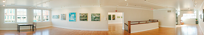
I'm not the only curator of the show. James and I really collaborated on this show, but he has been very generous in letting me come in and sort of reshuffle the deck. Everything you see in the gallery comes from the gallery's stock of art. These are all artists represented by the gallery. So, if you frequent Signs of Life, you've seen a lot of these paintings and drawings and prints before, but probably never this way. What the idea is here is to hang works of art, as James mentioned, close together - typically maybe three inches apart - so that they really are seen in a kind of close juxtaposition - works of art that have something in common. So that's the connection; the connection is made, typically, visually or thematically.
For example, there are a couple of works - let's just walk over here - this is probably the easiest place to start. ... [By having these two paintings together,] Suddenly, I think you look at each picture much more closely and carefully to see how they are different. What I am really interested in here is putting things together that have something in common in order to make you see each work as being more distinctive. I hope that this show basically forces people to stop and look carefully at each individual work because of the way they are hung. And you can't just sort of walk around and check everything off, you have to stop and say: ok, I see the apples, but that is not really the interesting thing.

What is interesting is how different George Wingate's small oil on paper painting of two apples, with a black background on a white surface, planted very firmly and solidly - how different that is from Justin Augspurg's painting of two bowls overflowing with apples and cloth cascading off the tabletop, an art book at the top. The technique, of course, is so different. Augspurg's paint is applied, perhaps, more richly, with more painterly touch. The surface of the canvas is very rough; he is working on a thick tooth, woven canvas - so, there is a different texture. That is not to say that one of these is better than the other, but that they are so different - even thought they are both paintings of apples, what's more interesting is how distinctive each one is.
My real hope here is to encourage appreciation of distinctive aesthetic qualities of each individual work that come out through this juxtaposition. Now, this, in fact, is an art historical trick; it's not a trick, but it's a technique, it's a method. How many of you have had an art history class? Many of you have; you're rather timidly raising you hands.
JS: They're afraid there's going to be a test.
DC: And I'll bet that in your art history class, your professor used two slide projectors, put two slides up on the wall, and was constantly comparing and contrasting. So this is a technique in art history that goes back to the nineteenth century; it goes back to the day of lantern slides that were the predecessor of thirty-five millimeter slides used today. And I think it is a very effective way of encouraging discernment of uniqueness through juxtaposition. So, that's the basic concept of the show, and beyond that, you're on your own. James and I got together and we came up with pairs in some cases triads that we felt worked together.
One of my beliefs about art - perhaps my fundamental belief about art - is that art is for bringing people together. Art is for encouraging conversation and discussion. A painting just sits on the wall by itself; it's mute and it's silent, it's lonely - but then when people come up in front of the painting and they look at it, suddenly it comes alive. There's the possibility for interchange and dialogue when two people come, or three people, or thirty or forty people - suddenly the art becomes this catalyst for a very rich conversation.
I think something else that happens here is that the paintings themselves ( I say paintings; some of them are drawings, some of them are prints, but mostly they are paintings) they are entering into conversations. So, even without us here, when James turns the lights off and goes home at night, I think the Wingate and Augspurg are still having a conversation... [laughter].
So, I'm really happy about how we've set up these little conversations between the works, but what I'm even more happy about is the possibility of people coming in, stopping and thinking: ok, why are they together, turning to their companion and saying: what do you think, what do you see? That's what I'd like to do in the next half hour or so is just encourage some conversation. I've been talking away here for five or ten minutes in front of this and let me throw it open and ask you what interests you in this pairing, in this juxtaposition? What comes out in this that you think is worth talking about?
A: I like the contrast. In this one [Augspurg's painting], it looks as if the apples could just fall into your lap; it looks asymmetrical and there is a real diagonal going on there. This one [Wingate's painting] has just a very sort of stable kind of feel to it; almost like they're icons, or something.
DC: Right.
A: Maybe they're not real apples; we're not really sure.
DC: So, the stability and the solidity of the Wingate, and the instability and the dynamism, the sense of things moving on a diagonal in the Augspurg. This is just like an art history discussion section. That's great... [laughter].
A: Maybe it's the way they are presented, but Wingate's apples seem very closed in; the colors are muted. Augspurg's apples are almost spilling out of the frame - and so this [Wingate's] is like, there are not very many apples, and it's getting less and less all the time. And here there is lot's of apples!
DC: So, there is kind of quality of restraint and a sort of-
A: Restriction.
DC:- restriction, excellent! And then [in Augspurg's] abundance, proliferation, profusion. One of the wonderful things about talking about art is it gets you to work out your vocabulary of adjectives and fancy nouns ... [laughter]. As an art historian, and I encourage my students to do this, we have to learn to say what we see; we have to learn to verbalize the visual.
And so we talk about constriction or reserve or a kind of sobriety in the Wingate. And in the Augspurg, maybe a quality of expansion or of spilling out. And you see what we are doing here by having these two paintings, very different, of apples next to each other (this is to reiterate my main point) is that we are seeing each one more clearly by comparing it to its neighbor. That is really what this show is all about. A lot of the pairings, I think, are not quite as pointed as this one; some of them may take a bit more work, maybe a little quirkier, but they might be more fun.
What about size? Size matters, doesn't it?. What do you think the expressive effect of these different sizes are on people?
A: To me the larger one enhances the smaller.
DC: James and I have noticed that too; that some paintings that you might not attend to suddenly become much more interesting when they are put next to something very different. And each one has a different mood, right, has a different personality. Works of art have personalities just like people, and, typically, we think that the artist's personality is expressed through their work, but it doesn't have to be that way. It could be that the artist has given the work its own personality. These are paintings with very different personalities; the one is very outgoing, expansive, colorful and bold. The other one is more reserved and quiet and humble. I think Wingate's work is very humble.

You see how we put a Wingate here, we put [another] Wingate here in a very similar kind of situation. Now, this is George Winate next to a Jeremiah Colonna-Romano, and this painting is just exploding with color and exuberant, rich brush mark and a kind of incredible vivacity. And the Wingate, again, is so concentrated, it's so quiet, it's so reserved and restrained, but they are almost like poles on the same continuum. I'm not sure there are any roses in Jeremiah's bouquet, but Wingate provides, maybe, the missing blossom.
And James and I, it's really more James than I, but he invited me in in the middle of the week, as he was hanging the show, and we worked a lot on where to hang the small ones. It's done now, but you can think what would it be like if the rose were in the middle, what would it be like if it were down here, what would it be like if it were over here [pointing left], and you can ask yourself why did James and David hang it there in the upper right? Any ideas, why do you think we chose that?
A: I really like it just because the luster of the rose is a part that comes out very vibrant and then it really makes me focus on the strong colors in the other picture; it draws me through to help me see what else is vibrant, and brings me to the blanket that I wouldn't even have noticed before.
JS: It introduces a theme, or motif that you see in the other painting.
DC: One visual reason that we hung it where it is is the diagonal of this line here in Jeremiah's painting that leads your eye right up to the Wingate; we like the way the black background in the Wingate picks up some of the dark colors down here. Of course, the reds talk to the reds in the painting here. But we tried it over here [pointing left], it just wasn't working as well. So, there is no formula here. In every case, it is a kind of intuitive process.
Artists are creative individuals; they create something that we look at as a finished product. But what James and I did is basically open the creative process up again and take their creations and then, I would say in a more modest way, apply our own creativity to arranging them. And it's not only how the Wingate and the Colonna-Romano hang together, but also how the whole wall works; we not only had to think about each pair or triad, but about the whole wall.

Here's another interesting pair and since one of the artists is here with us, we can put him on the spot. It's two landscapes. The one on the left is by Pierre Bollier of hills in Iowa, and the one on the right is by Paul Powis and, believe it or not, this is actually an English countryside scene, seen through the eyes of a Californian, perhaps. Although he is an English painter, I think he has been looking at painters like Wayne Thiebaud and Wolf Khan and certain other colorist landscape painters. But without me saying anything, I'll just throw it open and ask what you all see in these, and if the artist wants to chime in and start commenting, that would be great too.
A: I like how they break stereotypes of landscapes. When you said it was an Iowa landscape, where are the cornfields? Without knowing this is from Iowa, I thought of Europe. In Europe you could see many country sides like this. And I like the fact that being an American he has interpreted it this way. And then this British man who is taking more from California; I wouldn't expect this from an English countryside. I like how they break out of the mold.
DC: What's interesting to me in your comment is how I verbally sent you on a certain path that you might not have taken if it were just visual. Because when I identified the location, suddenly you started thinking in a certain direction and maybe you others did as well. So, I, in fact, sort of conditioned a kind of reading of these.
One of the interesting things for me in working with James is that I was working purely visually. I didn't know the titles. I didn't care about the titles. I didn't care whether this was England or that was the Midwest. I was working purely visually - and, so when you get more information, suddenly you start to understand the work in a different way. I mean, suppose that it turned out that George Wingate is allergic to apples and suppose it turns out that they are Justin Augspurg's most favorite fruit, right? Suddenly we would start understanding the pictures differently because of that information. So, in some ways, I preconditioned your response to these; so, let's try to and forget that and let's just look at them visually, which is what James and I did to begin with; that was the main premise.
In some ways, I wish that I could erase the titles here. This is one of my devices for museums - you've seen it happen, if you've never done it yourself - people spend as much time reading the label as they do looking at the work of art. So, what we need to do is invent a device that will only let you read the label if you stand in front of the object for a minute [laughter]. Here's a better ideA: there's a coin-operated label, and you have to put a coin in to read the label, but if you stand there for thirty seconds it will come on for free. But, you see I want to get away from titles. ( Heather has these complicated titles that will completely change the way you understand her work too.) Visually, what about the way that space works?
A: Can I ask a basic question here? I probably wouldn't put these together because of the color of the frames. To me, it bothers me that one is so dark and one is so light. I love the idea of putting things that are similar together and I would probably do that when I am decorating, but I can't get past that.
DC: Well, if you would like to buy one of these, I'm sure James would reframe it for you. [laughter] Our budget did not permit us to reframe anything. But, you make a good point. Hanging them together, suddenly you are aware of the frames a lot more than you would if they were hung individually.
The idea of the picture frame is to create a kind of separation between the world and the work of art. It's a kind of marker: outside of the frame is the world, inside the frame is the work of art. It really comes from the window, right? You look through the window and you see a rectangular frame around it; the view through the window is out there, and the frame separates that space from in here. So, in this case, Pierre's frame is very dark and heavy and Paul's frame is light wood, with a white mat; there is a kind of conflict there.
Space. What I'm interested is how the space in Pierre's picture goes back; it really moves the eye toward that horizon. You sort of move across the undulations of the landscape into that grey sky in the distance and it really feels like you are traveling into the painting, into space. Now Paul's painting, because of the way he works with these diagonals and these wedges, he really moves the eye up. So, there is a kind of ascension, a kind of verticality versus the more inward-going and horizontality.
You know, the format is very important (I'm lecturing here, which I didn't want to do - it's too late now, you can't stop me) [laughter] One of the things I teach my intro art history students and the upper level too, if they will listen to me, is that the orientation of the format is fundamental to the compositional dynamics. That is, a horizontal format tends to have a kind of expansion towards the sides; a vertical format tends to lift the eye up; and I think that these two paintings, actually, each one works with that in its own way.
Obviously, the colors are different; it's a more muted palette in the Bollier, and a kind of exaggerated, abstracted palette in the Powis. But we hung them together because they are both elevated views across a landscape, towards a horizon, trees and fields and a sky, but they are so different. And, again, I think each one becomes more interesting because of the juxtaposition.
Pierre did you want to say anything?

Pierre Bollier: It's interesting to hear everybody's comments. The linear quality of both paintings is a similarity that I see. You hit on it that his is vertically ascending, and mine is a horizontal format, but that was one of the things in the key things in the land that I really keyed in on, was that horizontal crisscrossing of the land going back. It's interesting to see the same kind of compositional attention going on in both of them.
DC: That was the thing that first set us off. I'm glad you mentioned that; how there are these diagonals, almost perpendiculars that create these kind of zones of space. You have much more subtle light and dark transitions that move the eye through, and Paul is doing it more with color, warm colors, cool colors. He starts with a red ground (Is that right, James?) and he builds up from that. But he is sort of moving the eye with these wonderful trees; they are like a ping-pong effect. You are moving the eye much more through these sort of sinuous, bands of trees. Actually, this reminds me a little of - those of you who know the Grant Wood painting in the Spencer, which is also an Iowa landscape - how he uses those trees that tend to separate one field from another, to move the eye back along the line.
Here we have another painting by Jeremiah Colonna-Romano who did the exploding floral still-life on the other wall. And a painting by a Lawrence artist who is with us, Heather Smith Jones. Why do you think we hung these together? This isn't a hard question.
A: The skies are very interesting.

DC: Yes, the skies were the connecting theme here - very close in the range of colors: the blues, the whites, the muted whites.
A: Two square formats, too.
DC: Yes, that's very interesting. You know, the square format is unusual for landscape. The square format of all formats is the one that is the most self-contained and holds the energy in a kind of centered way. So, there are those similarities too.
Heather Smith Jones is, I think, the only artist in the show who departs from a straight-forward, representational image - even if it is invented, rather that observed. For example, some of the prints by Joan Bohlig: you know she didn't see the angels up in the sky, but, nevertheless, it is a kind of holistic image of motifs brought together in a kind of logical way.
Heather draws images from different places. Obviously, the Madonna and Child come out of art history - so, I'm particularly drawn to her work, but then she is also combining two very disparate landscape views. One is this view of a sky with yellow and other colors inexplicably placed within it. But then you also have this horizontal strip of road and the trees along the side, in a very different palette that seems to be observed from a very different place.
Then, of course, you have the floating fish: this one, literally, a fish out of water; this one of a fish floating up in the clouds. So, in some ways, I think Heather's work is about - not about making connections, but what would the opposite be? - disconnections. Really, this goes back to surrealism. I don't know if you think about that much, but the idea of a painter like Max Ernst or Rene Maigritte: putting together images in a painting that have no logical reason for being together in that space, a kind of pre-association images. But then when you put all of these strangely brought-together images next to this much more straight-forward, observed scene of nature, I think in some ways it draws some of the energy out of Heather's painting and transports it over to this one. Suddenly, the trees and everything start to talk to the trees over here.
In this (pairing), to me, there is a lot more to try and puzzle over in terms of meaning. I think the apples (pairing) is sort of the freshman level essay question, and this one you have to work with more. I just have been looking at these for a couple days now and I would be interested to hear from Heather if she wants to talk or from others who might have some insight into what's going on here.
A: It seems the one on the right [Heather Smith Jones' painting] makes explicit what the one on the left is also; that they both reference some sort of the spiritual force or supernatural force in their life. The one on the right makes that clear, but that memory that you get from the one on the right translates back into the painting on the left - and you start seeing that because of what you saw in the other one.
DC: Is it almost like you imagine what it would be like if there were a saint in the sky in the one on the left?
A: I think it's there.
DC: It's implicit.
JS: That's interesting because Jeremiah is a great fan of El Greco, and I think he was thinking about El Greco's clouds. He calls this painting ŇLandscape with Hard Clouds.Ó There is some sort of formidable activity happening in those heavens, and you get that with El Greco too: you get things just wrestling or happening. So, I like what you said because the painting does lift your eye above to what is going on up there. Heather has a sky that also makes you ask: what's going on up there? There is a whole other invisible realm that is made visible, to my eye at least, of some things that have happened in heaven and on here on earth. It's fun to hear you pick things up that are true to what I know the artists are working on, their sources, where they are coming from. That's good.
A: It seems like the one on the left you've got experience, and the one on the right, you have more of something to think about because you see both views, and there is a narrative and a title. I know we're not supposed to look at the title, but that really tends to make you want to decipher it.
To me the painting on the right, the sky is like the surface of a pond, like Monet's lily pond, and there's these fish. On the road, there are so many cars that come down the road that have a plastic Virgin and Child on the dashboard...
DC: Suddenly that becomes a view through a windshield. In some ways, in Heather's paintings, the work that we're doing in a lot of these new juxtapositions is happening within the frame of her painting. So, in some ways, there's a deciphering going on within this work of art as well as a conversation with its neighbor.
We won't have time to look at everything in here. Let's go into the next room... This painting on the right is actually by the fellow who did the the two apples on the black background and the rose. Wingate has basically, from what I have seen, two very different working manners: one very small and concentrated, the other one, these larger oil on canvas works that are more abstract.

This one to me is suggestive of a rocky coast line and maybe some water. I guess all suggests sky in some way, but what I was interested in here was this wedge of light, watery colored that sets up a kind of conversation between Pierre Bollier and the George Wingate. Again, how we hang them is very important; we tried Bollier at different levels and on the other side, but we felt that it worked best here on the left.
Remember we read, as Americans, from top to bottom and left to right so your eye is going to tend to start in the upper left and go to the lower right. In many cases, we did hang a small piece in the upper left next to a larger work on the left - so, you tend to see the smaller one first and then with the gravity of the larger one, you go down to the right.

I really am pleased with this one. This is another Jeremiah Colonna-Romano; it's a small square scene of a forest in winter and Heather Smith Jones. Again, Heather like to makes these juxtapositions within her own work, but in this case her work is not only a kind of split personality, with the abstraction on the left and this much more naturalistic scene on the right, which I think (Heather) told me (she) did from nature. Is that right? So (she) was sitting there actually sketching.
But then also we have Jeremiah's painting here on the right. I'm using their first names although I don't know them personally; it's just I hang out with James, and he knows them all. But I like how we go from color to monochrome and back to color. And how we have two kind of cropped views of trees and leaves and you don't really see much of the sky. It's almost like this work has escaped from this one, or suddenly turned into paint and color, instead of being in colored chalk or colored pencil.
JS: This is where I have to say something about the color. When I am looking at this painting with customers, I try to give them a handle into the abstraction and, knowing a bit about how Heather works, I feel like this associates something with the forest even though it is an abstraction. If you look at the colors: this little sliver of violet, such a color seen in an evening sky or a winter sky. Obviously these paintings weren't made together, but because they were both looking at similar things or remembering similar experiences, commonalities start to come up and the associations make these things stronger.
It is the same thing with those greens in the Bollier and the Wingate. A lot of artists like to avoid the greens; it is a kind of hard palette. Paul Powis said when he was in art school in the 60's, the first assignment that they gave him was to mix a green that wasn't blue and wasn't yellow, and he spent three days. So, artists struggle with greens, and Pierre has a great way of bluing it down, graying it down to make them not so hard to look at, as sometimes greens can be. It is the same thing with Wingate's wonderful scumbling and layering of paint to make subtle color shifts; those are commonalities between these.

DC: This is one of my favorites. It's Bruce Herman's ŇHanging Garden,Ó at the left, which is perhaps the most abstract thing in the show. Then a small painting by Jodi Hays Gresham which looks very abstract until you realize that it is a kind of aerial view of a winding river and fields. Of course it's abstracted, but I was interested in the kind of coloristic conversation with the greens particularly in this and the kind of sinuous curvy lines that talk to the snaky lines there. I liked the large and small dynamic; James had several larger paintings by Hays Gresham, but they weren't as Happy next to the Herman.
Then when James hung this up next to Heather's painting, suddenly you see the greens and the little snaky lines in it; they are talking so that you jump from one pair to the next, and the conversation expands.

I am really pleased with the triad here: two drawings by James Lipovac flanking the little etching by Joan Bohlig. When you get in closer, you can appreciate the differences in technique: the way that the charcoal is used to create different densities of tone, from very deep blacks to greys and the white of the paper is allowed to show through. Then in etching, a linear medium, tone is created not through the rubbing of charcoal, but through thicker line or density of fine lines. I am very interested in how these artists lead you into an interior space through diagonals, down stairways, through open doors, in through a portal. In all three cases, that works in a different way.

We originally had this small painting on paper by Sara Hayward - who is the wife of Paul Powis - hanging with these, but it wasn't happy, so we gave it it's own little corner. This is the only work in the show that is not close to another one and yet it is still talking to these three and it is also talking to the window. So, it is making you aware, I hope, of art as part of the world. It is both a framed object that exists in its own space, but also can draw your attention to the physical space you are in; you can look into this work through the imaginary window and then turn around and look out the actual window.
When Paul and Sara were here earlier in the year - they had a show in the gallery - they actually painted the view out this window. I thought that was a nice bringing this full circle. Of course, this is painted in the south of France, Matisse country, as you can tell by the subject matter.
This one here we will conclude with. We don't want to keep you all night. Here is Rick Beerhorst on the right, and another Justin Augspurg on the left. Justin is the one who did the apples next to the Wingate that we all looked at in the beginning. To me, this one just clicked immediately.

I had been to the gallery a number of times in person, but the genesis of this show was James sent me a CD. I just clicked on all the images and started to think about categories: ok, there are a bunch of landscapes, a lot of landscapes actually, there are some still-lives, a few figurative paintings, some cityscapes. These two cityscapes to me just wanted to hang together. Obviously, they are both elevated views of elevated highway that winds into the painting and draws the eye to the horizon where you have tall buildings, but they are so differently stylistically.
To make the point that I made at the beginning and we will make one last time: hanging together two works that have similarity in subject then encourages you to appreciate how different they are in terms of technique and style of expressive effect, personality. Some of you may prefer the one on the left and some of you may prefer the one on the right, but I think they both become more full themselves by being placed next to something that is similar and yet different.
So, I would be happy to hang out for a bit and talk before we disperse.
JS: Thank you David.
